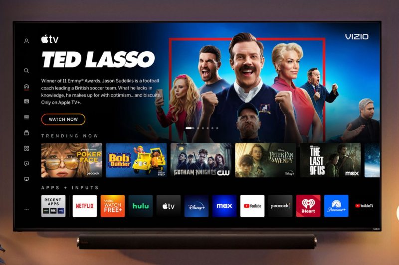
Home Screen will be available for “most” Vizio smart TVs from 2016 and later. | Image: Vizio
Today, Vizio is announcing a completely overhauled homescreen experience for its TVs that will eventually make its way to models dating back as far as 2016. The new interface looks sleeker and more modern than the company’s existing SmartCast OS. And Vizio went the direct route with branding: the new software is just called Home Screen.
Take one look at the revamped user experience and it’s immediately clear where Vizio drew inspiration from: this basically looks like its own streaming service. All the telltale signs are there. A column of navigation icons on the far left? Check. There’s the usual hero slot at the top with immersive artwork, custom typefaces / logos, and autoplaying video.
It’s much easier to tell at a glance which…

